We turned in our calendars this week. I am happy with the end result.
Now it is time to focus our attention on the design manual. I have the idea of the double helix cheerio being the basis of the cheerio, I just have to work on my refinements for how I am going to edit the whole semester down into a book. I also want the book to have a scientific feel to it so I feel like that is going to be my challenge over the weekend. I scanned all of my greyscale, color studies and contrasts in today as well.
Friday, November 23, 2012
Monday, November 19, 2012
Calendar Final


What began as 8 images for the seasons has turned into an academic calendar. The process has been taxing but it is well worth it. All of the modular and off image designs narrowed down to one was a difficult task but was able to help me grow as a designer to be able to edit and make corrections from those edits. My final calendar I am pleased with although I wish I could have more time to edit it. I guess you are never happy with your own design. I designed my calendar with all of the white space relating to other parts of the calendar and it is designed off grid. The numbers fit within the columns of text and the colors were taken out of the images. I am pleased with the calendar logo and years and how they are incorporated into the design. It is playful like the pictures yet graphic, just like the pictures.
Saturday, November 17, 2012
Week 12


The final calendar is on it's way, as well as the manual. The attempted die cutting will begin over the weekend!
Monday, November 12, 2012
Week 11
Every week that we design calendar, it becomes more clear as to what we should be striving for our designs. As I took my sketches and refined them, I became attached to certain concepts and ideas.I took elements from different sketches and evolved them into different concepts. I have had the hardest time with my off image concepts. My images have circles and diagonals and I feel like I am stuck with either or. Trying to marry the two has been challenging. I ended up with one circular design and one diagonal design off image. I feel like my success lies in my modular designs, but time will tell how I decide which design to choose for my final. The process that I have gone through has not only been engaging my knowledge of design and growth of it but it has also been enjoyable.
My manual concept is a double helix cheerio. I plan to make it like a scientific diagram like what is in a science textbook. I am happy with this choice and can't wait to begin design over the weekend.
cheerio= building blocks of design
DNA (double helix)= building blocks of life
design=life
My manual concept is a double helix cheerio. I plan to make it like a scientific diagram like what is in a science textbook. I am happy with this choice and can't wait to begin design over the weekend.
cheerio= building blocks of design
DNA (double helix)= building blocks of life
design=life
Sunday, November 4, 2012
Week 10
I began to think of ideas for my manual this last week. While trying to think of how I can explain just how much the cheerio has helped my thinking this semester, I got overwhelmed and thumbed through a magazine. I feel like I may have gone insane for a brief moment. I saw cheerios everywhere in the design. The cheerio was in the text in the page layout and in the images. Everywhere Cheerios. I couldn't escape it because a cheerio is a circle. A circle has no beginning and no end. When you get to the end you are back at the beginning. In the same way with our projects when we complete a project we must relate it back to the cheerio. It is the simplest answer and yet it contains all of the design elements. I never realized just how important a little cheerio is.
While working on the calendar this week I took a look back at the greyscale compositions to see how I could try and incorporate it into my calendar. The ideas that I have are rough but hopefully at the end of week 11 I will have a more concise idea for my final.
I like the calendars with the black background because they make my pictures pop when I put them on the wall. I also like the abbreviated months instead of the whole words.


Sunday, October 28, 2012
WEEK 9
This week we began our research for calendar. Some questions that I asked when researching calendar were: what is a calendar? How many kinds of calendars is there? What is the function of the calendar? What is the history of the calendar? How have designers made calendars? This is what I found to be the most important statement to calendar:


A calendar is a system of organizing units of time
for the purpose of reckoning time over extended periods. By convention, the day
is the smallest calendrical unit of time; the measurement of fractions of a day
is classified as timekeeping. The generality of this definition is due to the
diversity of methods that have been used in creating calendars. Although some
calendars replicate astronomical cycles according to fixed rules, others are
based on abstract, perpetually repeating cycles of no astronomical
significance. Some calendars are regulated by astronomical observations, some
carefully and redundantly enumerate every unit, and some contain ambiguities
and discontinuities. Some calendars are codified in written laws; others are
transmitted by oral tradition.The common theme of
calendar making is the desire to organize units of time to satisfy the needs
and preoccupations of society. In addition to serving practical purposes, the
process of organization provides a sense, however illusory, of understanding
and controlling time itself.


Here are the different images of calendar that I found to be the most interesting from the eyes as a designer. How I develop the sketches for my calendar from here on out will need to be as visually interesting.
Friday, October 19, 2012
Week 8
October 16-18:
Today the problem statement/ creative brief was revealed.
The graphic design department is in need of a calendar for
the academic year 2013-2014 it will be shown in the new
graphic design gallery next year. It will also be shown in
the
new spring
show. Possibility it may be printed.
We were also given the assignment to research calendar
and all the variables. Also the history of calendar and that
the calendar is an academic calendar so it starts in August.
We were also given the grid and are going to begin to
develop the
grid and how it will relate to our calendar.
Also I am starting to develop the calendar logo with Futura
and
Baskerville as my typefaces for calendar. Below are some
rough
 |
| Logo Sketches |
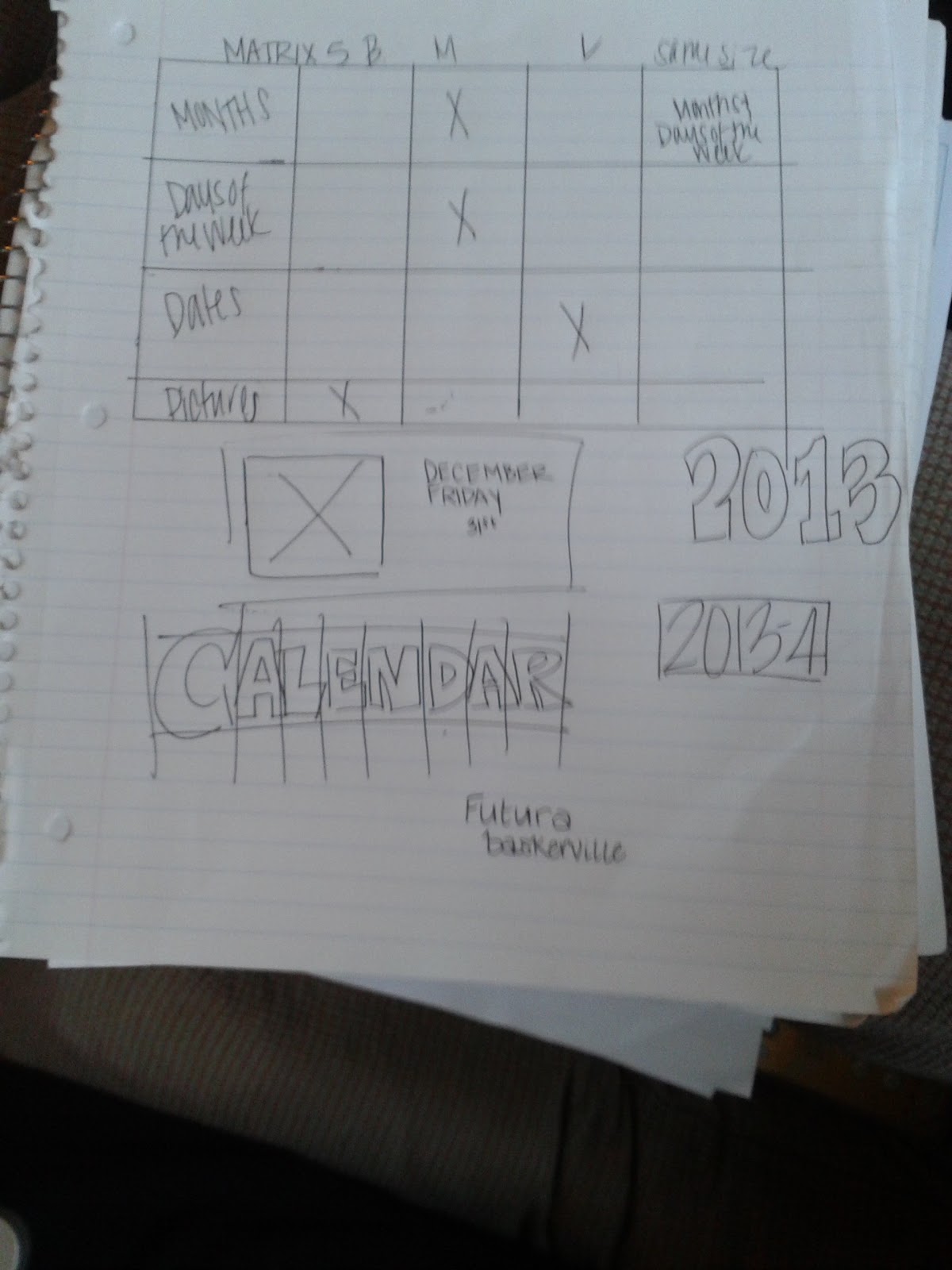 |
| Matrices |
Monday, October 15, 2012
Week 7
Today in class Gwen talked with us the 6 steps to critical
thinking.
Knowledge: define, list, arrange, identify.
Application: describe, discuss, explain, classify.
Comprehension: demonstrate, discover, choose, produce.
Analysis: Breakdown, compare, contrast.
Synthesisi: arrange, combine, compose, design.
Evaluation: Conclude, defend, judge, predict.
Blooms Taxonomy.
working on. I developed my own problem statement to try to get an
understanding of what it is that I should be focusing on:
Construct 3 different compositions that are the four seasons, Winter,
Spring, Summer and Fall. Make sure that each comosition includes
at least one season and has eight images. The format needs to be
4x6” high quality photos, eight images that tell a story and hold
visual interest. The images will contrast as they tell a story. The image
sequence should also have interruptions to create rhythm, focal points
and grouping.
As I develop my images I will be able to more clearly make a dynamic set
of images.

Wednesday, October 10, 2012
What makes us look

I also added a picture of my series of images that are currently in development. I am trying to find a cohesive system that systematically grabs the viewers attention and makes them want to stay there and study my images. I still have more development to do.
Thursday, October 4, 2012
Cheerio and how it relates to all of the problems

How would someone else see this problem and solve it?
I think that if someone who was outside the major and The University read my blog... they would be confused. I definitely need to post more images and edits to the blog so that what I am saying can be translated into a visual for someone who hasn't spent the time trying to solve the problem. They would note though my further understanding of what each problem reveals to me week by week.
Tuesday, October 2, 2012
Week 6
"I see graphic design as the organization of information that is semantically correct, syntactically consistent, and pragmatically understandable."
Massimo Vignelli
Vignelli is the creator of American Airlines logo as well as many other corporate logos. He also is a packaging designer and has created the popular Bloomingdales bag. I found the information on his web site.
http://www.vignelli.com/home.html
I think that what he is saying is that graphic design has to be understandable. It needs to communicate a clear message through its legibility in text and arrangement in image. Design also needs to have consistency... but it can't be too similar. There need to be repetitive elements without being obvious.
This ties into what I talked with Gwen about today in class in my series of images. She told me that they had too similar of shapes and that I needed to communicate my message by breaking apart my images into interval. Once I could see the "skeletal outline" of the image to see the direction and what axis they were based upon, I was able to see what she meant. I need to think of how to clearly communicate my message in a subtle way and how to begin to make my grid help to further communicate this message through the use of text.
Thursday, September 27, 2012
Week 5
My first set of images that I took for the seasons project were very representational. My table group and I developed mind maps to try and abstract the seasons. I got ideas from this, but not abstract ideas. I went out and purchased various items that were "abstracted" seasons. I bought various fruits and drinks that one could connect to the seasons. After I printed my contact sheets, I became dissatisfied with the results. The images were too representational.
The next day in class, I made a word matrix with all of the design principles. I found that although this was more challenging for me than the mind map, I had a better concept of how to abstract the images. I will know after I shoot my next set of pictures.
The next day in class, I made a word matrix with all of the design principles. I found that although this was more challenging for me than the mind map, I had a better concept of how to abstract the images. I will know after I shoot my next set of pictures.
Monday, September 24, 2012
Project 2: leaves and linear shadow


Week 4
After having taken 4 different sets of photos, I finally understand the simplicity of the project. It was such of a relief to know that I didn't have to re-shoot my photos. I was very excited that there were some interesting visual differences in my set.
Saturday, September 15, 2012
Week 3
When we take an image, we see a leaf and an interval shadow. We need to train ourselves to see beyond the obvious. We need to see the design elements working together to make an image that is interesting by incorporating the different design principles. It's hard to see the design elements in a photo. It's even harder to see them when you are setting up an image which I failed to do during the first attempt. If we analyze the problem statement instead of just jumping into the problem, it will help us see more clearly what we need to do.
"The hardest thing to see is what is in front of you. It is not what you look at that matters it's what you see."
"The hardest thing to see is what is in front of you. It is not what you look at that matters it's what you see."
Sunday, September 9, 2012
Week 2
"A picture is worth a thousand words."
The expression "Use a picture. It's worth a thousand words." appears in a 1911 newspaper article quoting newspaper editor Arthur Brisbane discussing journalism and publicity.
I think that for us as graphic designers, this phrase is a reflection into the work that we do. We need to be expressive with our imagery. The text shouldn't explain the message, the image should be compositionally strong enough to tell the story behind the image so that text doesn't have to.
Wednesday, August 29, 2012
Week 1
“Every human has four endowments- self awareness, conscience, independent will and creative imagination. These give us the ultimate human freedom... The power to choose, to respond, to change.”
- Stephen Covey
As an artist, no matter how much you agree or disagree you have the ability to express your thoughts in countless ways. However you can imagine.
The Rule:
Be universal remember it is not about you.
The graphic designer needs to remember that even if we really like an idea we have or concept, that we need to keep the client in mind. They make the ultimate decision.
Subscribe to:
Posts (Atom)